Orchard Autonomy Pack - Feb 2016 Geo-referenced Yield Map
Jump to main Orchard Autonomy Pack page.
The map below was not made with the system described above, rather it was produced by manually stepping through the process that is currently under development. As such it tests several aspects of the envisaged algorithms, data handling and data visualisation.
In the map tree yields are represented by the colour - red being poor and blue good; and the tree canopy volume by the size of the boxes.
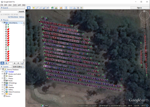
Looking carefully at the map it is clear there are still some location errors to be fixed. It is also interesting to note the level of variability in yield and that there are both very large and very small structures in the variability, indicating that Precision Agriculture techniques applied down to the single tree level will have significant benefits for tree crops.
To see the whole thing it needs to be viewed in Google Earth with this file. Testkml